Editing & post-production
Color: why grading changes the perception of quality
Sometimes a video just looks “amateur” and the viewer can't even say why. It's almost always the color. Treating it well is one of the fastest ways to make a video look expensive — and it's the other half of “looks professional,” right alongside the audio.
~7 min read
1. Color happens in two stages
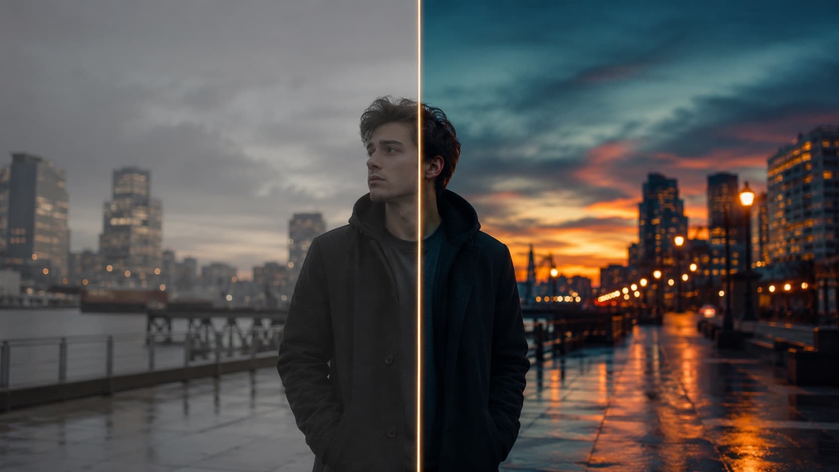
A lot of people think “adding color” means slapping a filter on top. It doesn't. The work has two very distinct phases — and the order matters:
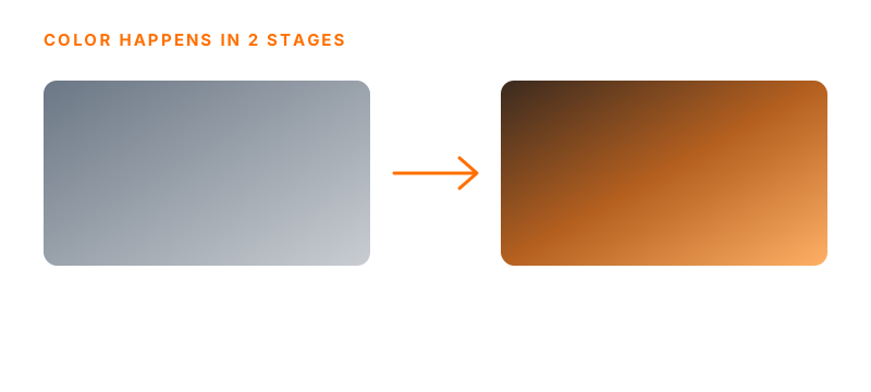
- 1. Correct (color correction) — make the image right: balanced exposure, white that's actually white, contrast on point. It's the neutral base, and nothing works without it.
- 2. Add the look (color grading) — only then comes the creative part — the color that creates the mood, the identity, the “feel” of the video (warmer, cooler, more vivid).
Skipping correction and going straight to the look is the classic mistake: the filter sits on top of a crooked base, and the result looks “over-edited” and amateur.
2. What correction really adjusts
- White balance — remove the color cast (yellow from a bulb, blue from shadow) so white is white and skin looks natural.
- Exposure — get the highlights and shadows on point — without blowing out the light or crushing the shadow into detail-less black.
- Contrast — add depth by separating light and shadow, without washing the image out or muddying it.
- Saturation, just right — vivid color fools you in a still but tires you in a video. Vibrant ≠ garish.
- Skin tones — the anchor for everything. The human eye instantly notices when skin goes too green or too orange — get the skin right and the rest falls into place.
3. The look: mood and identity
With the base correct, the look is the signature. This is where choices come in like warm tones for coziness, cool for tension, or cinema's classic “teal & orange” (bluish shadows, orange skin). A LUT (a color preset) can be a good starting point — but that's all it is: a start. Without correction first, a LUT works no miracles.
Two cautions with LUTs: (1) lower the intensity to around 50-70% — a maxed-out LUT screams amateur; (2) most “cinematic” LUTs are made for log (flat) footage. Drop one of those on a normal phone video and it “doubles” the color and breaks everything (crushed shadows, weird skin). Rule: log → first convert to Rec.709, then the LUT; normal video → the creative LUT goes on directly. There are free LUT packs (.cube) on ON1, FilterGrade and Color Grading Central.
A quick glossary so you don't get lost:
- LUT — a ready-made color “recipe” in a file (.cube) that transforms the colors all at once — like an Instagram filter, but professional and adjustable. E.g., a “teal & orange” LUT gives a cinematic feel in one click.
- Log / “flat” — a way of recording the image “washed out,” with no contrast and a bit gray ON PURPOSE — ugly straight out of the camera, but holding the MOST information so you can sculpt the color in the edit (the “raw clay” of color). E.g., D-Log (DJI), S-Log (Sony), Apple Log (iPhone).
- Black and white (B&W) — strip all the color out (zero saturation) — it focuses on light, shadow and emotion. Great for a dramatic or timeless mood.
- Sepia — a monochrome in a warm-brown tone: the “old/nostalgic,” faded-photo look.
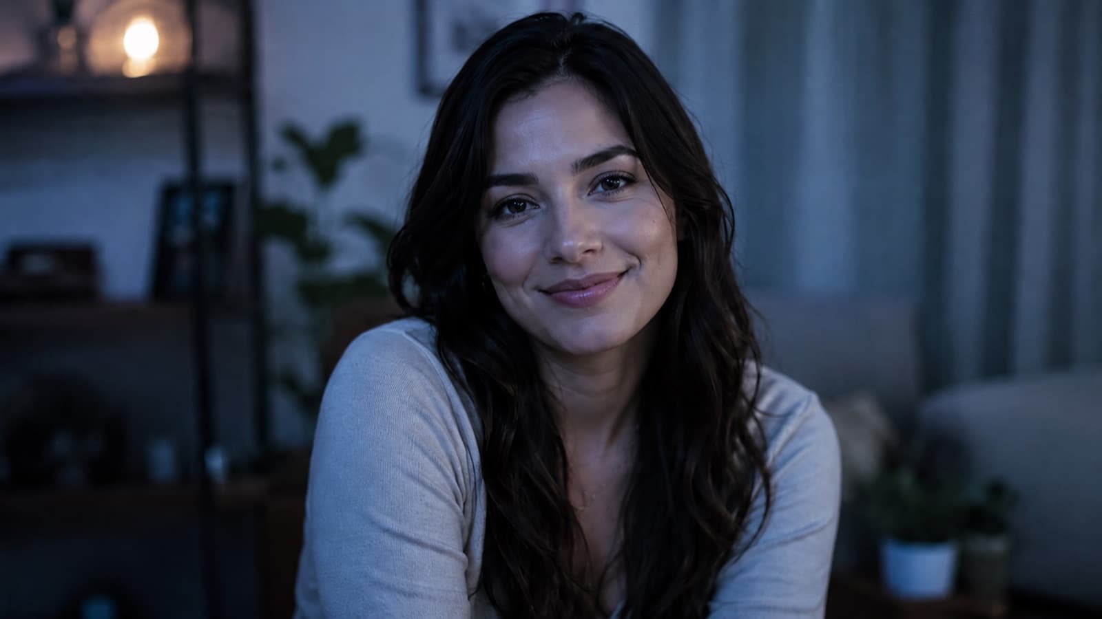
The same shot, four looks — color picks the emotion before a single word is spoken:



4. Why this changes everything
The eye perceives quality before reason does. An image with careful color reads as professional instantly — even if the viewer can't explain why. It's the same video, the same camera, but the feel changes completely. Together with clean audio, it's what most separates “amateur” from “expensive.”
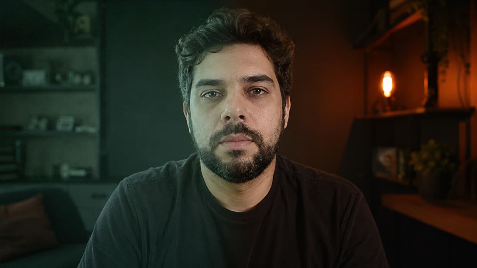
5. The eye lies — check it in the right place
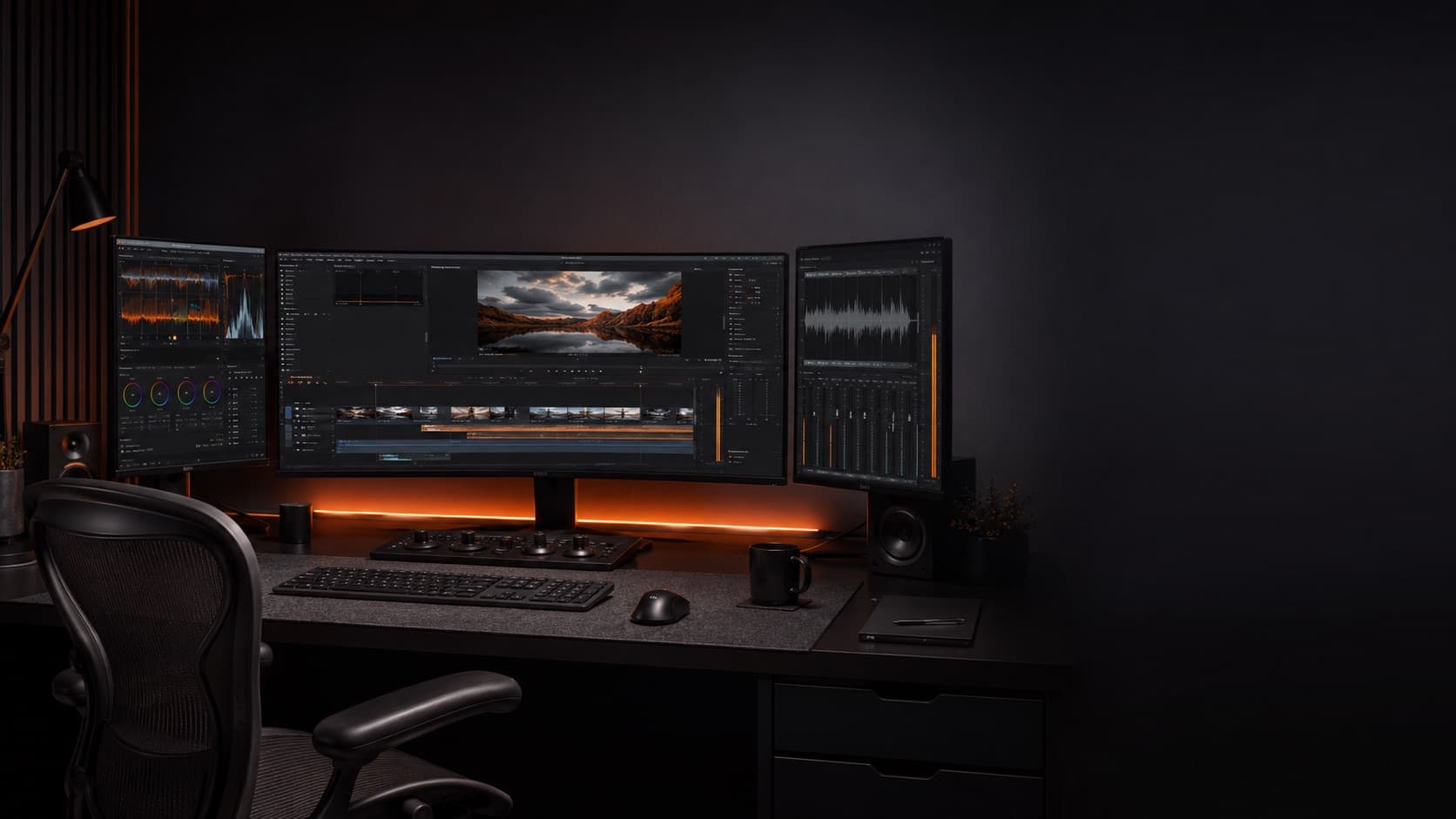
Careful: different screens show different colors. Grading on a phone or an uncalibrated monitor is a recipe for a nasty surprise. That's why a professional editor uses a calibrated monitor and scopes (graphs that measure the image objectively, like the waveform and vectorscope) instead of trusting the eye alone. It's what guarantees your color holds up on any screen.
In plain language, the 3 scopes that matter:
- Waveform — measures BRIGHTNESS (exposure), from 0 (black) to 100 (white). Hit 100? you blew out the light. Stuck at 0? you crushed the shadow with no detail.
- Vectorscope — measures COLOR (hue + saturation). There's a “skin tone line” around 10:30 (between red and yellow) — well-lit skin on ANYONE falls on that line (it's the color of the blood under the skin, not a “standard color”).
- Parade (RGB) — shows red, green and blue side by side — on white/gray the three should line up. Blue high = too cool; red high = too warm. It's white balance made visible.
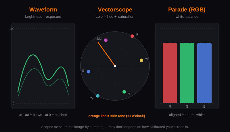
And RGB? It's the trio that forms every color on a screen: Red, Green and Blue. Mixed at different intensities they make any color; the three equal make neutral gray/white — which is exactly what the parade shows.
6. Consistency builds a brand
A strong channel has a recognizable color identity: every video looks like it belongs to the same family. When each video has a different color, the channel looks messy; when there's a pattern, it looks like a brand. It applies within a single video too: shots filmed at different moments need to “match” each other (the famous match).
7. Start with the shoot
- Good light makes everything easier — soft, well-distributed light gives you a base that color only needs to enhance — not repair.
- Lock white balance — a manual setting on the camera (instead of auto) keeps the color from “jumping” mid-shoot.
- Avoid blowing out the light — blown-out white doesn't come back in the edit. When in doubt, shoot a little darker.
- Shoot “flat/log” if you can — if your camera has a flat (log) profile, it holds more information for color — it needs correction afterward, but gives you far more room.
- Use a gray card — film 2s of a neutral gray card (18%) at the start: in the edit you just click on it and the white is right instantly — and it doubles as an exposure reference. Cheap, solves both.
Color starts with light (good light = easy color) and gains room when you shoot in 4K/log. In the edit, color comes last — after the cut (see the editing fundamentals).
8. The first step (without becoming a colorist)
You don't need expensive software or a calibrated monitor to start getting value out of this. On your own phone or in free CapCut, the order is the same as item 1 — correct first, add the look second:
- Fix the white first — if the image is yellow or blue, move the “temperature” until white is white and skin looks natural. It's the adjustment that fixes the most.
- Exposure and contrast by eye — lift the shadows a touch and hold back the highlights so they don't “blow out.” Without overdoing it.
- Saturation with a light hand — a little more color already adds life. If skin pulls toward orange, you went too far.
- Only then, a look — now try a filter/LUT — and bring the intensity down to around 50%. A maxed-out filter is what gives away the amateur.
- Save it as a preset — like the grade? Save it and reuse it on the next videos. That's how your “feel” is born — the consistency from item 6.
9. Color tools: what to use
- DaVinci Resolve (free) — the king — the FREE version already ships with the most advanced color corrector on the market (wheels, curves, nodes, scopes). It's the serious path without spending a cent. The paid one (Studio, one-time purchase, no subscription) only adds AI/noise reduction — almost none of which you need for good color.
- CapCut — on desktop it imports .cube LUTs + has an adjustment panel (real color work); on phone, only the ready-made filters (no .cube import). Good for getting started and for a quick clip.
- Premiere (Lumetri) / Final Cut — if you already live in them, the color panel is complete — but they're paid (subscription / one-time purchase).
Best free path for serious color: edit wherever you like, but do the color in free DaVinci Resolve.
10. When it's worth leaving the color to a pro
Correction is learnable — but it takes time, demands a trained eye, and to keep it identical across every video it becomes recurring work. If your focus is filming and growing (not becoming a colorist), it makes sense to hand this part to someone who does it all day: the color comes out consistent, with white on point and natural skin, and your calendar doesn't depend on you becoming a specialist. It's the same logic as hiring a good editor: you get your most valuable hours back.
At HEY JOE, color correction and grading go into every edit — with a broadcast-standard eye and color matched across your videos, so your image gains the depth the audience feels instantly.
Quick questions
What's the difference between color correction and color grading?
They're two stages, in this order. Color correction makes the image right and neutral — balanced exposure, white that's actually white, contrast on point. Grading (the “look”) comes after: it's the creative part, the color that sets the mood and identity (warmer, cooler, “teal & orange”). Skipping correction and jumping straight to the look is the classic mistake — the filter sits on top of a crooked base and the result looks amateur.
What's the best free program for color work?
DaVinci Resolve, available worldwide. The free version already ships with the most complete color corrector on the market (wheels, curves, nodes and scopes) — it's the serious path without spending a cent. The paid version (Studio, one-time purchase, no subscription) only adds AI and noise reduction, which you almost never need for good color. You can edit wherever you like and just do the color in DaVinci.
Can you color correct on your phone?
You can, and it's a great start. In your built-in photo/video app or in free CapCut, you fix the white (temperature), adjust exposure and contrast by eye, raise saturation with a light hand, and only then apply a look — always at low intensity (around 50%). The order is the same as the pros: correct first, look second. You don't need a calibrated monitor to start getting value out of it.
What's a LUT and how do I use it without messing up?
A LUT is a ready-made color “recipe” in a file (.cube) that transforms the colors all at once — like a filter, but professional and adjustable. Two cautions: lower the intensity to around 50-70% (a maxed-out LUT screams amateur) and respect the type of footage. Most “cinematic” LUTs are made for log (flat) footage: in that case, convert to Rec.709 first and only then apply the LUT; on normal video, the creative LUT goes on directly. There are free packs on sites like ON1, FilterGrade and Color Grading Central.
Do I need a calibrated monitor to grade color?
To get started, no — but for reliable results, it helps a lot. Different screens show different colors, so grading on a phone or an uncalibrated monitor is a recipe for a nasty surprise on other screens. That's why pros use a calibrated monitor and scopes (graphs like the waveform, vectorscope and RGB parade) that measure the image objectively instead of trusting the eye alone. It's what guarantees your color holds up on any screen.
How do I keep color consistent across my videos?
By saving your grade as a preset and reusing it. A strong channel has a recognizable color identity — every video looks like it belongs to the same family. Define a treatment you like (after getting white, exposure and a subtle look right), save it, and apply it to the next ones. It also applies within a single video: shots filmed at different moments need to “match.” It's consistency that makes a channel look like a brand, not a mess.
In the end, good color is discreet: nobody will praise your white balance — they'll just feel that the video looks expensive. Correct first, add the look second, keep it consistent — and when you'd rather take it off your plate, color is part of every edit at HEY JOE.